Where is my web traffic sent when I surf the internet? What companies interact with my data as I bounce from one site to another? That’s what we set out to explore with our assignment this week.
I focused my traces on three domains I visit every day from both my apartment and the ITP floor. The three domains were twitter.com, techshop.ws, and google.com. I chose to run these traceroutes from two separate physical locations to test discrepancies between the results from each.
For me, the most interesting aspect of this assignment is the physical distance traversed between real ISPs and network providers. The traces themselves yield IP addresses, which in turn are associated with physical server locations, some that can be surmised by the domain associated with them in the route results. Others are obscured behind the IP addresses themselves, and some are completely invisible behind a string of three asterisks.
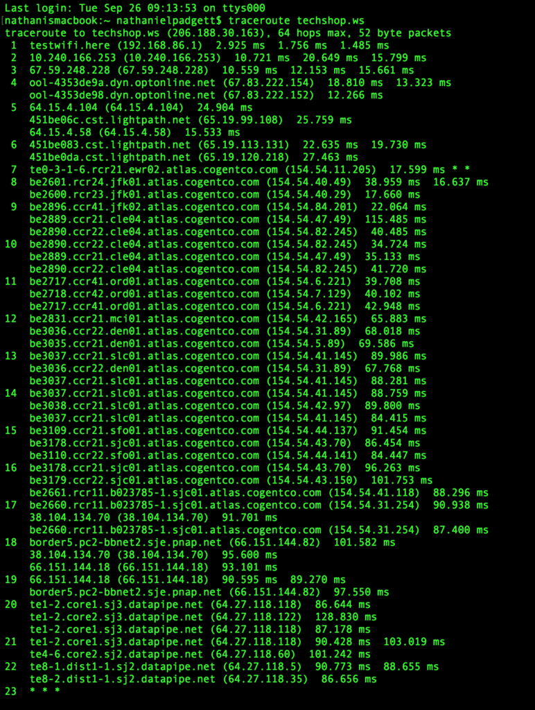
Domains like optonline.net in the sample traceroute above give away the source of the trace—in this case Optimum, a subsidiary of ISP Cablevision. With this information one can get close to an approximate location of the trace, especially if city information is included in the subdomain.
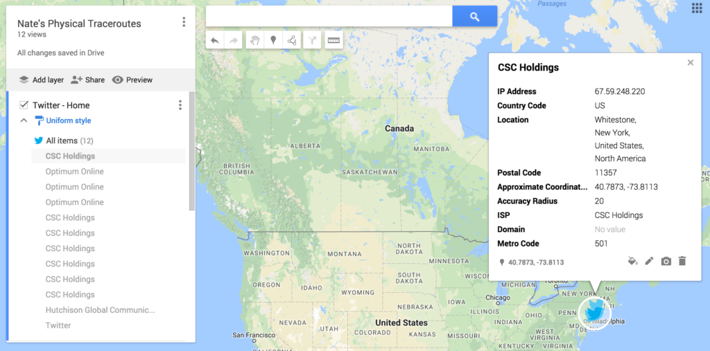
To reveal the approximate physical address of the IP addresses and in-specific domains, I used MaxMind, an IP intelligence and fraud detection tool. I copied the results of each traceroute for Twitter, TechShop, and Google from my apartment and ITP into MaxMind’s GeoIP2 City Database. This gave me the approximate longitude and latitude of the IP addresses, as well as the organizations they are associated with. I then copied this data into separate CSVs, which I then uploaded into Google’s map builder tool.

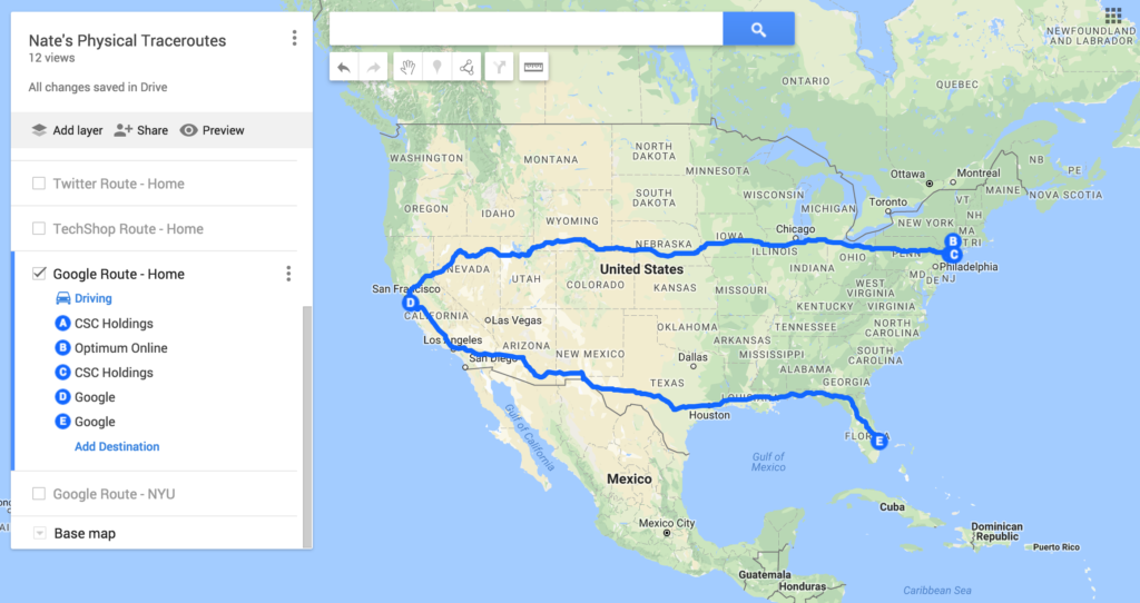
I added unique icons to represent each domain traced on the maps, and to differentiate between traces from my apartment and the ITP floor. I then created driving directions for each of the traces from my apartment.
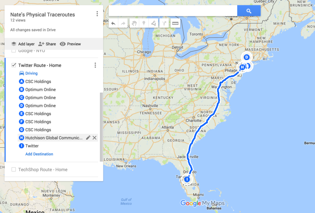
Google limits the number of layers one can add to a custom map, so I was only able to make one set of driving directions for my NYU traceroute. I chose google.com because the routes from my apartment and NYU were so different.

Two features of Google map builder made visualizing this data particularly interesting:
- Google let’s you associate all data from a CSV with a given pin on the map. This means that each trace result (represented by a given pin) includes the associated ISP, country code, location, and postal code information.
2. Driving routes can be expanded to step-by-step directions. This let’s me estimate the physical travel distance for my traces.
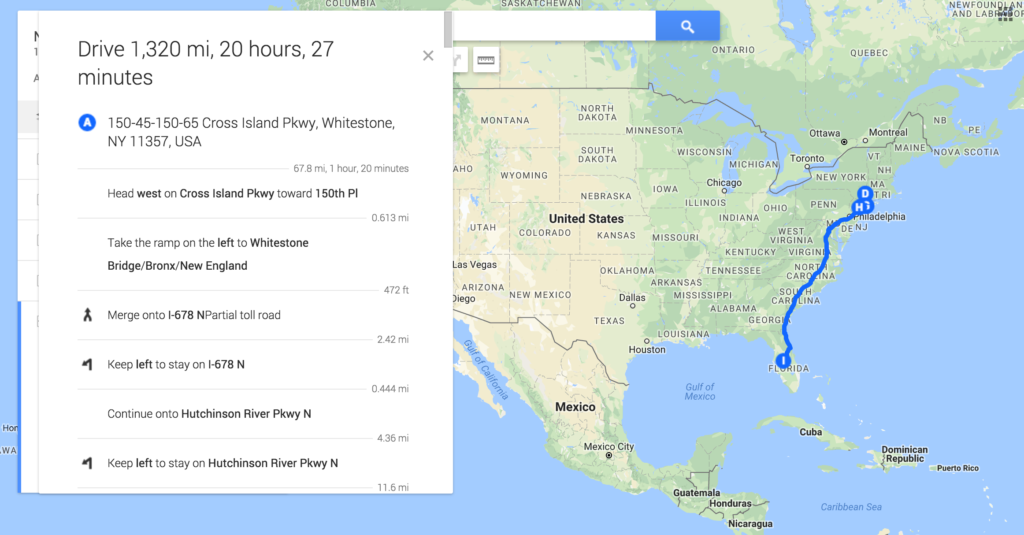
The one downside is that the step-by-step directions are only visible to me as the administrator, so here are the approximate physical distances traveled for each of my traces that I was able to map driving routes to:
Twitter – Home: 1,320 mi
TechShop – Home: 3,030 mi (does not include and overseas trace which couldn’t be mapped)
Google – Home: 6,139 mi
Google – NYU: 4,164 mi
Note that the distance is less when browsing from NYU…
The full, interactive map can be found here and below for you to explore. Note that you can click on a given pin or destination to investigate further.